AI กับงานอนุรักษ์ภาพประวัติศาสตร์: การลงสีภาพเครื่องแบบทหารสยามในสมัยรัชกาลที่ ๖
AI กับงานอนุรักษ์ภาพประวัติศาสตร์: การลงสีภาพเครื่องแบบทหารสยามในสมัยรัชกาลที่ ๖
สวัสดีครับทุกท่าน 👋
หลังจากที่ผมได้โพสต์เกี่ยวกับเครื่องแบบทหารสยามในช่วงต้นรัชกาลที่ ๖ ไปเมื่อไม่นานมานี้ ก็มีผู้ติดตามหลายท่านสอบถามเข้ามาว่า ภาพถ่ายขาวดำดั้งเดิมนั้นสามารถลงสีได้อย่างไรบ้าง ต้องขอขอบคุณทุกท่านสำหรับความสนใจและคำถามครับ วันนี้ผมจึงขอแบ่งปันขั้นตอนการทำงานแบบเต็มรูปแบบของผมให้ทราบกันครับ
ก่อนอื่น ผมขออธิบายว่า ปัจจุบันเทคโนโลยี AI สามารถทำได้มากกว่าการสร้างภาพใหม่จากคำบรรยาย (text-to-image), การแปลงภาพเป็นภาพ (image-to-image), วิดีโอจากข้อความ หรือภาพต่อวิดีโอ อย่างที่หลายคนเข้าใจกัน หนึ่งในเครื่องมือที่ทรงพลังแต่ยังไม่ค่อยมีคนพูดถึง คือ ระบบตัดต่อภาพด้วย AI ครับ
เนื่องจากผลงานของผมส่วนใหญ่สร้างขึ้นจากการฝึกโมเดล LoRA เฉพาะทาง ผมจึงไม่อิงกับระบบปิดอย่าง Midjourney หรือ Google Imagen แต่จะใช้ ชุดเครื่องมือแก้ไขภาพ AI เพื่อปรับแต่งและยกระดับผลงานที่ผมสร้างขึ้นด้วย Flux LoRA ให้สมบูรณ์ที่สุด
วิธีการทำงานของผม (My Workflow):
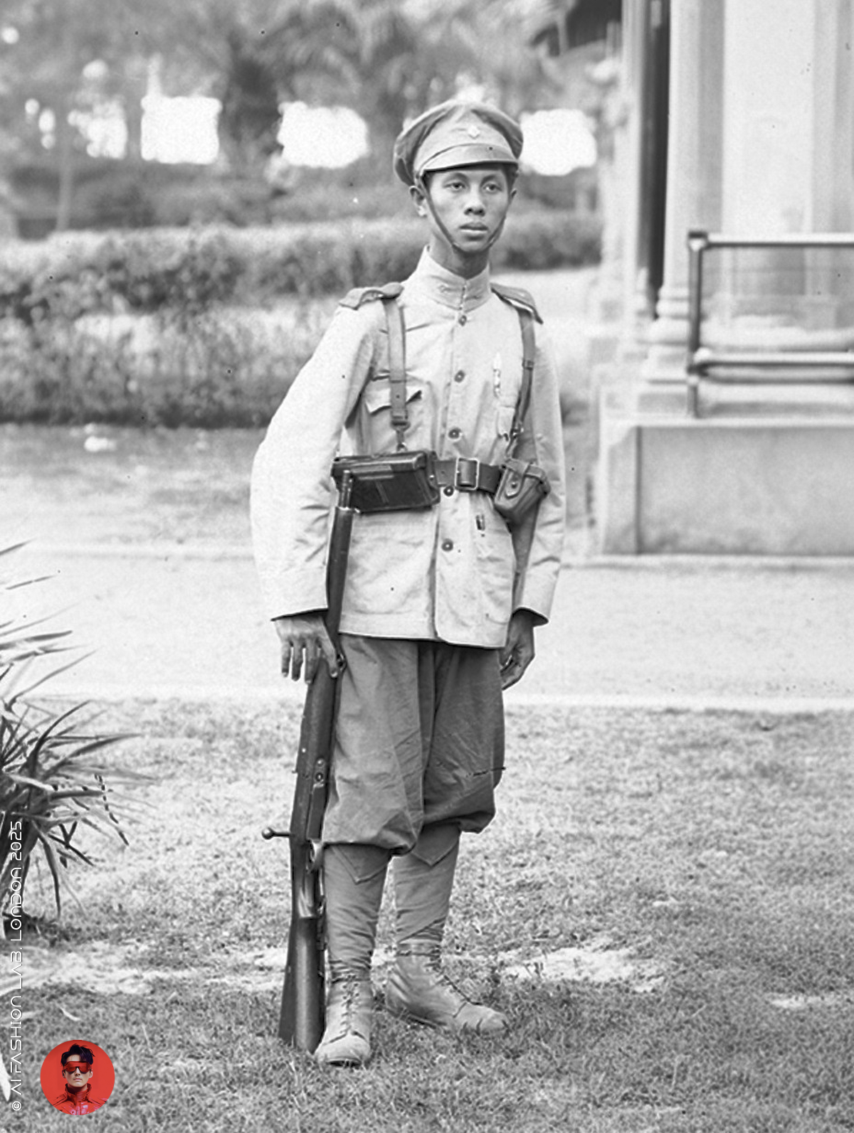
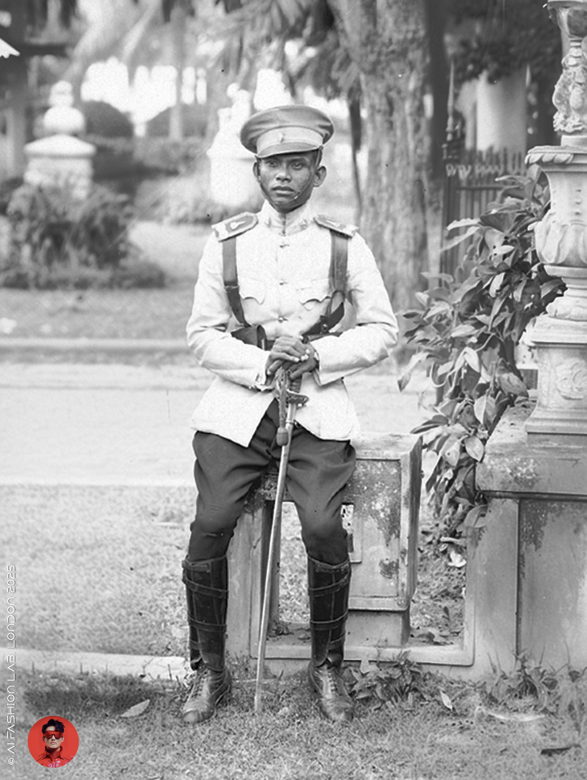
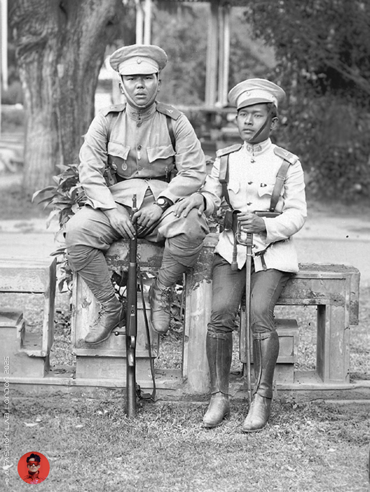
เริ่มจากการลงสีภาพขาวดำต้นฉบับ
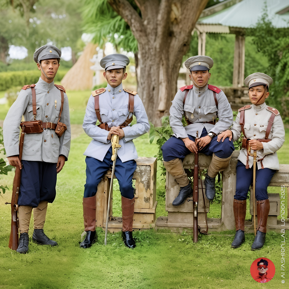
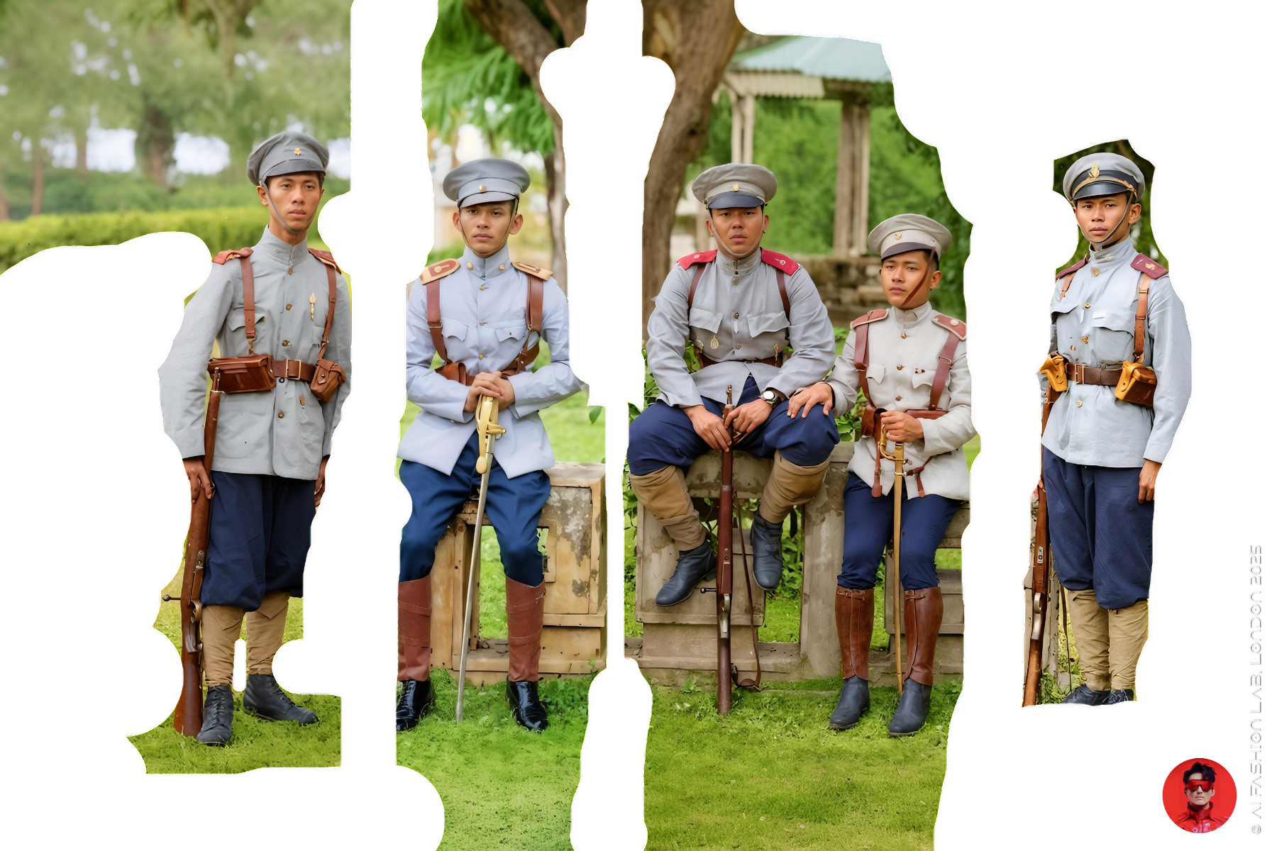
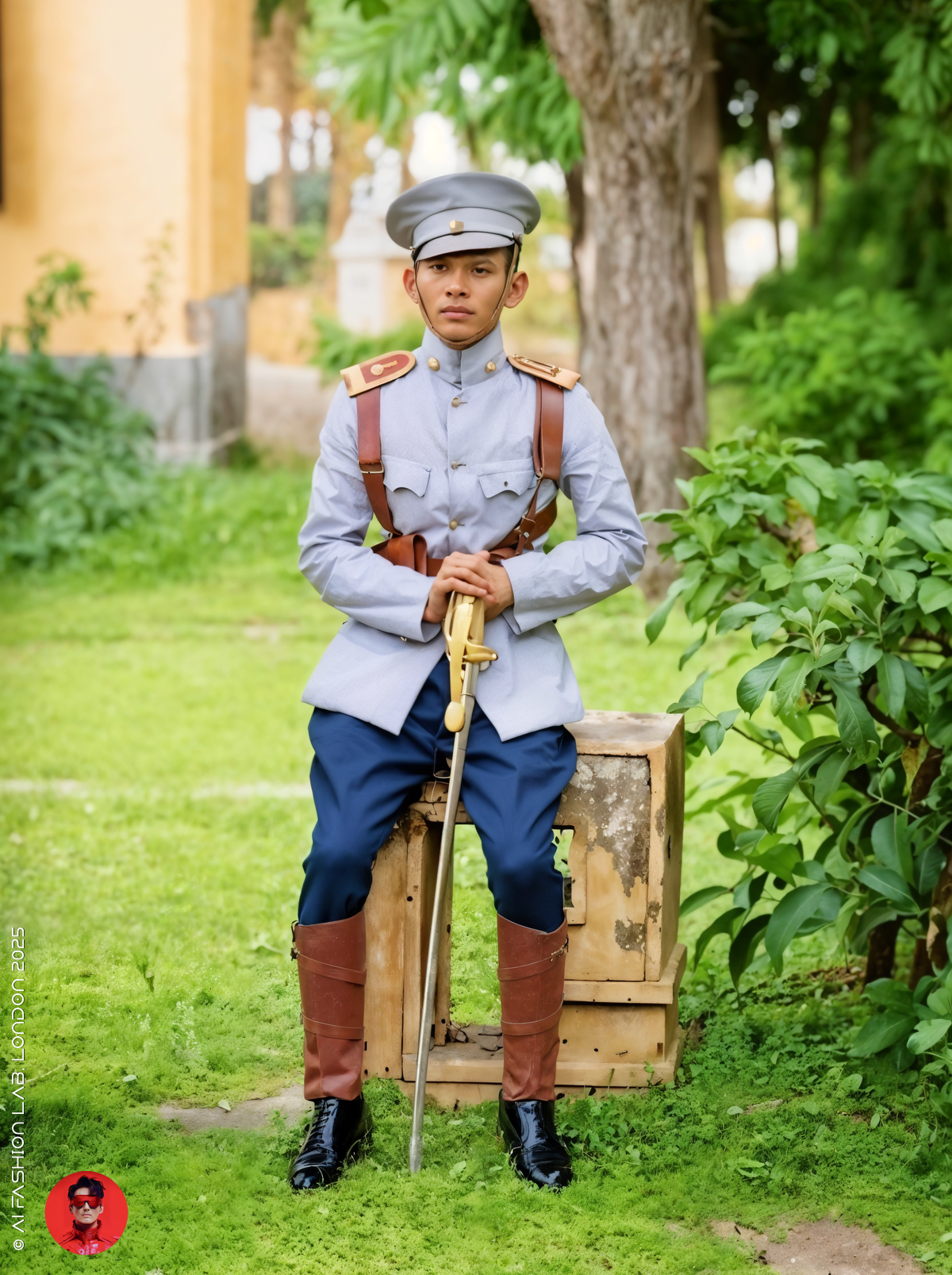
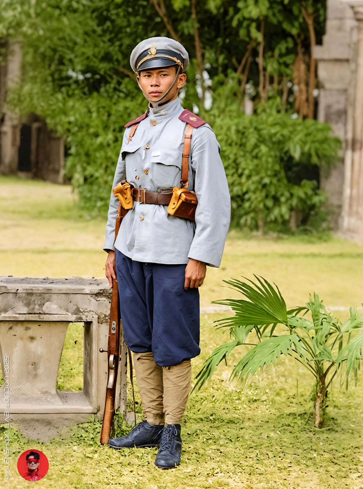
ยกตัวอย่างเช่น งานล่าสุดของผมที่เป็นภาพทหาร ๕ นายในเครื่องแบบรัชกาลที่ ๖ ซึ่งแต่ละคนสวมใส่ชุดเหมือนกันแต่แต่งต่างกันในรายละเอียดการแต่งตัว จึงต้องใช้ความพิถีพิถันในการลงสี
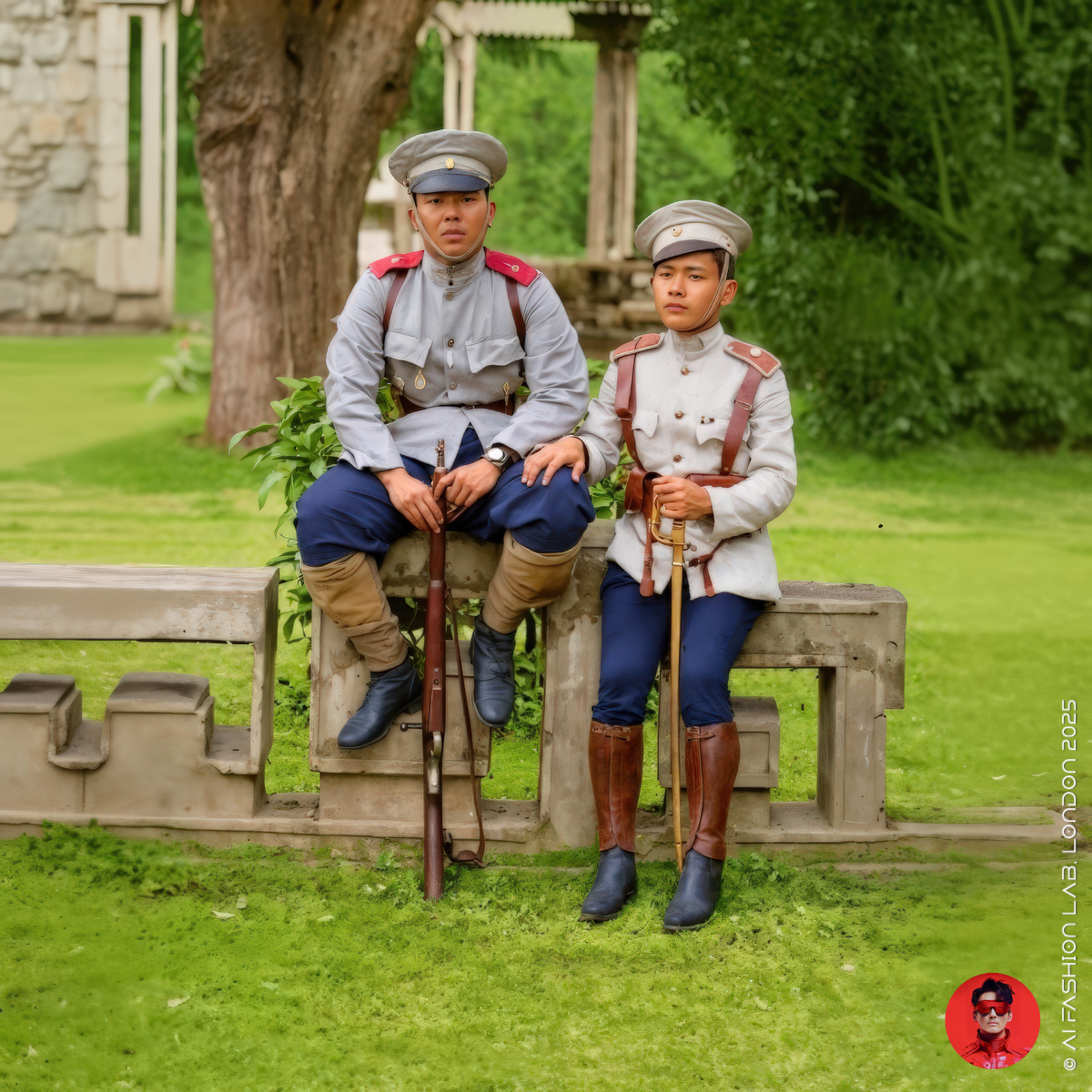
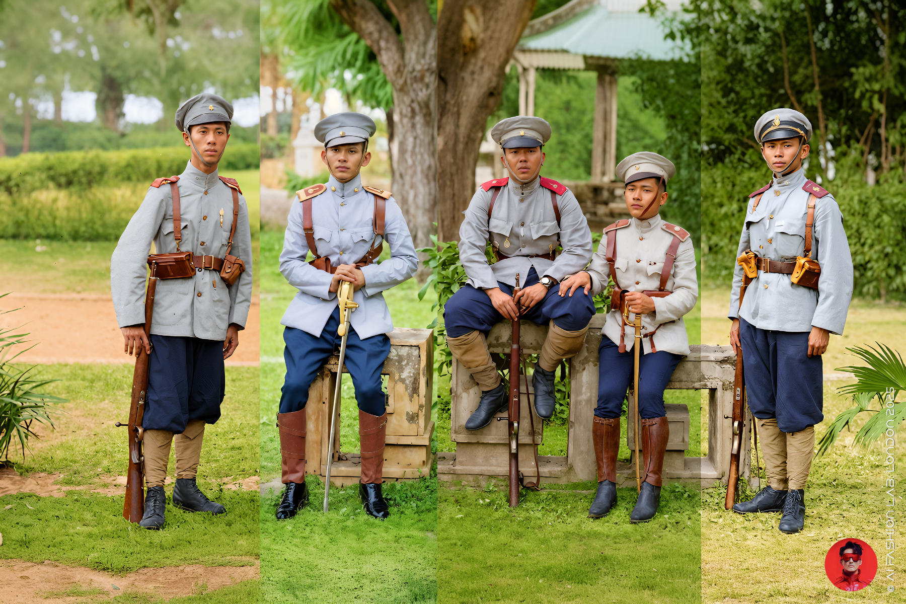
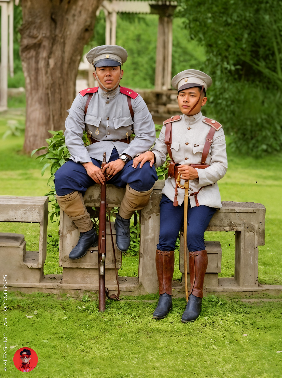
ผมแก้โจทย์นี้โดยการแบ่งภาพออกเป็น ๔ ส่วน แล้วใช้ Flux Kontext ผ่านระบบ Freepik ในการลงสีแต่ละส่วนแยกจากกัน โดยอ้างอิงจากข้อมูลประวัติศาสตร์ที่ได้รับคำแนะมา
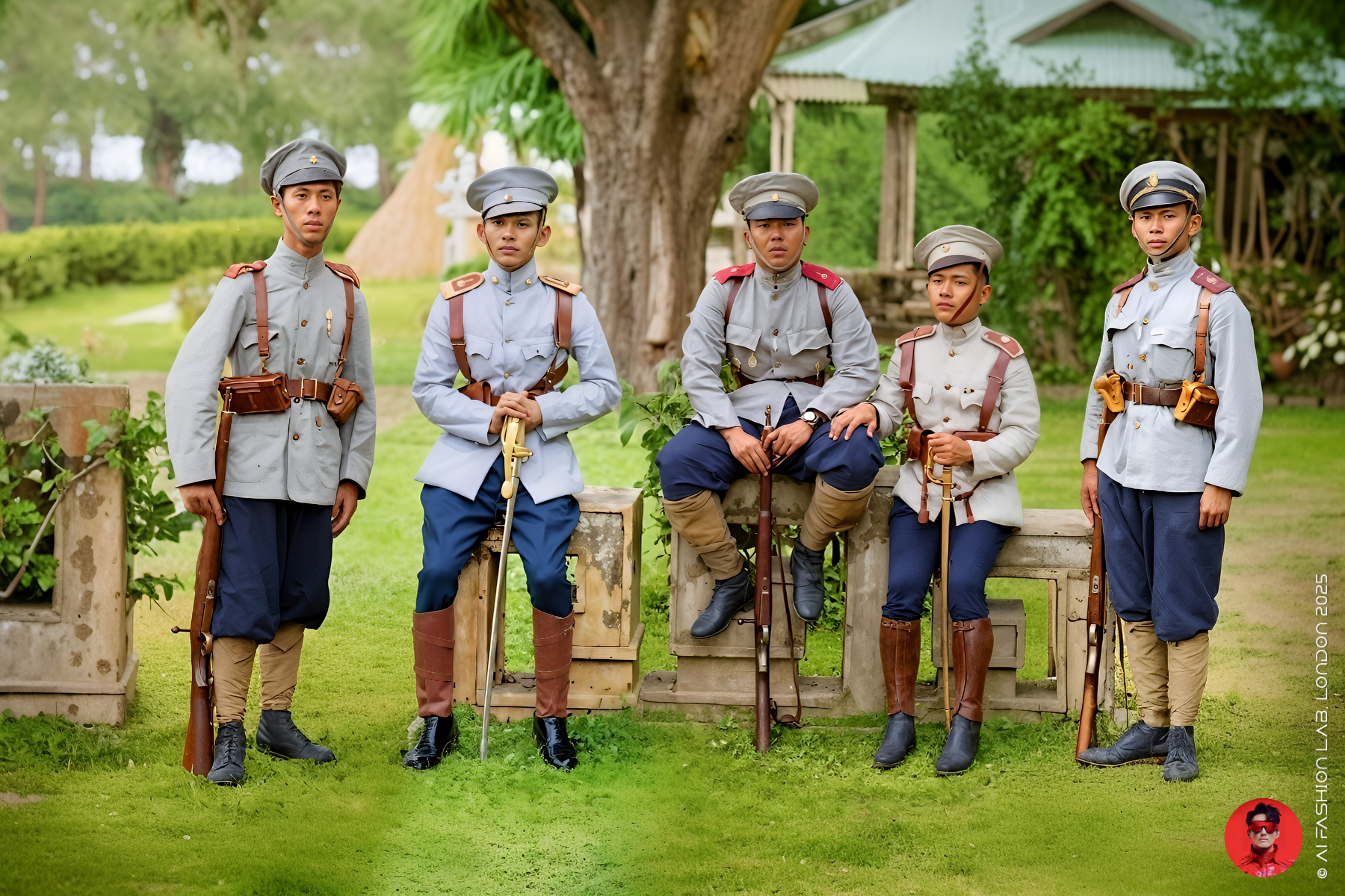
เมื่อได้ทั้ง ๔ ส่วนแล้ว ผมนำมารวมเป็นภาพเดียวอีกครั้ง
ในขั้นตอนนี้ สีและพื้นหลังมักจะยังไม่กลมกลืนกัน แต่สามารถแก้ได้ง่ายมากด้วยเครื่องมือ AI ที่ใช้ลบหรือแก้ไขเฉพาะจุด แล้วให้ AI ปรับฉากหลังให้ใหม่อย่างแม่นยำและรวดเร็ว
เครื่องมือที่สามารถใช้ได้ ได้แก่ Freepik Edit, Krea Edit, Photoshop Firefly หรือหากถามถึงตัวที่ผมชอบที่สุด ก็คือ Midjourney Editing Suite ครับ ซึ่งเหนือกว่าเครื่องมืออื่นในเรื่องการผสมสี ลบรอยต่อ และปรับองค์ประกอบให้กลมกลืนกันได้อย่างชาญฉลาด
Patina Tone คืออะไร?
เมื่อเราลงสีภาพถ่ายเก่า โดยเฉพาะภาพเกี่ยวกับเครื่องแบบทหาร สิ่งสำคัญที่ผมใช้เสมอคือแนวคิดที่เรียกว่า “patina tone”
Patina หมายถึงร่องรอยของกาลเวลาที่ทิ้งไว้บนวัสดุต่าง ๆ เช่น โลหะ หนัง หรือผ้า เมื่อผ่านการใช้งานจริง สีของวัสดุจะเปลี่ยนไป เช่น หม่นลง จางลง หรือเปลี่ยนเฉดสีไปอย่างเป็นธรรมชาติ
ในแง่ของสี Patina tone จะมีลักษณะ:
ไม่ฉูดฉาด เป็นสีหม่นหรืออ่อน
มีความเก่า ขุ่นมัว หรือดูซีด
มักมีโทนสีน้ำตาล เทา เขียว หรือเหลืองเจืออยู่
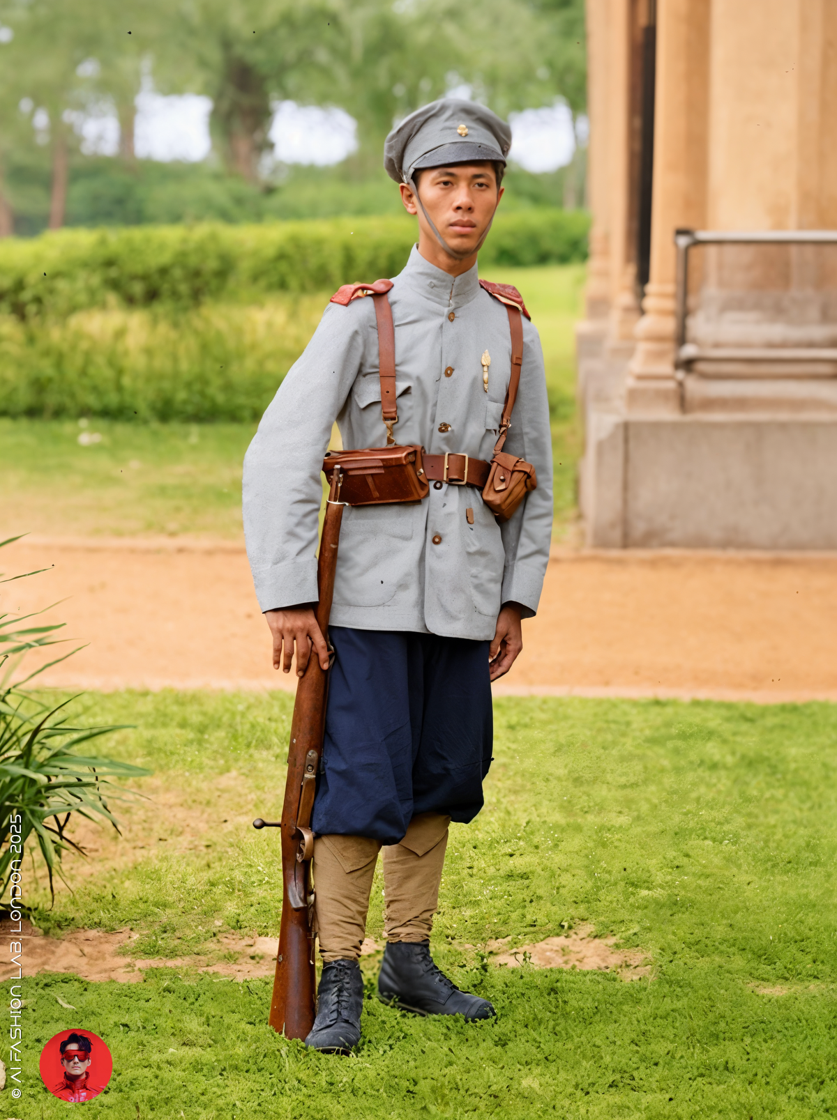
การใช้โทน patina จะช่วยให้ภาพดูสมจริง เหมือนวัสดุที่ผ่านกาลเวลามาจริง ๆ เหมาะอย่างยิ่งกับภาพที่ต้องการความน่าเชื่อถือทางประวัติศาสตร์
ทำไมต้องใช้ Patina Tone ในการลงสีด้วย AI?
การเลือกใช้สีสมัยใหม่มักทำให้ภาพดูหลอกตาและขาดเสน่ห์ของความเก่า การใช้คำบรรยายที่มีคำว่า “faded”, “sun-bleached”, “dusty”, “worn” ในการสั่ง AI จะช่วยให้ภาพที่ได้ดูมีความเก่าแบบธรรมชาติ
ตัวอย่างคำสั่งลงสีด้วย Patina Tone
ถ้าคุณกำลังลงสีภาพถ่ายทหารสยามช่วงต้นคริสต์ศตวรรษที่ ๒๐ แทนที่จะใช้คำสั่งว่า:
“olive green uniform”
ลองเปลี่ยนเป็น:
“olive drab uniform with faded patina tone, sun-bleached khaki edges, dusty texture from tropical wear”
คำสั่งแบบนี้จะช่วยให้ AI จำลองความเก่าและการซีดจางของเนื้อผ้าได้แม่นยำมากขึ้น โดยเฉพาะในบริบทของเครื่องแบบที่สวมใส่ในภูมิอากาศร้อนชื้นอย่างสยาม
🧵 ตัวอย่างสี Patina พร้อมรหัส Pantone
เวลาที่ผมลงสีภาพประวัติศาสตร์ ผมมักใช้รหัสสี Pantone เป็นแนวทางควบคู่กับคำบรรยาย เพื่อให้ได้เฉดสีที่เหมาะสมที่สุด เช่น:
ผ้าทหารสีเขียวมะกอกที่ซีดจากแสงแดด:
Pantone 16-0726 TCX — คำสั่ง: “faded olive”, “sun-bleached”, “worn texture”ผ้าฝ้ายคอตตอนสีกากีที่ถูกแดดเผาในเขตร้อน:
Pantone 15-1119 TCX — คำสั่ง: “dusty khaki”, “tropical sun-exposed”เสื้อขนสัตว์ที่ผ่านกาลเวลา:
Pantone 19-0516 TCX — คำสั่ง: “deep faded green”, “oxidised”, “forest patina”เข็มขัดหนังหรือรองเท้าหนังเก่า:
Pantone 18-1022 TCX — คำสั่ง: “cracked brown”, “worn leather”, “dark patina”
การผสมผสานระหว่าง คำสั่งแนว patina กับ รหัสสี Pantone นี้ ช่วยให้ผมสามารถจำลองบรรยากาศและเฉดสีในภาพให้ออกมาอย่างใกล้เคียงกับความจริงในอดีตได้มากที่สุดครับ
หมายเหตุเรื่องความแม่นยำทางประวัติศาสตร์
ความยากที่สุดของกระบวนการนี้ ไม่ใช่แค่เรื่องการใช้เครื่องมือ แต่คือการ เลือกใช้สีให้ถูกต้องตามประวัติศาสตร์ เพราะภาพที่ผมทำขึ้นไม่ได้มีเป้าหมายเพียงความสวยงาม แต่ยังเป็นแหล่งอ้างอิงเชิงวิชาการให้แก่ผู้สนใจประวัติศาสตร์ เครื่องแบบทหาร และแฟชั่นในสมัยนั้น
การใช้ โทนสี patina ควบคู่กับ รหัสสี Pantone จึงช่วยให้ผลงานของผมมีความน่าเชื่อถือ และพร้อมสำหรับการนำไปใช้เป็นส่วนหนึ่งของการศึกษา วิจัย หรือแม้แต่การออกแบบเครื่องแต่งกายในภาพยนตร์หรือนิทรรศการประวัติศาสตร์ครับ
Preserving History with AI: Colourising Siamese Soldiers from King Rama VI’s Reign
Hello krub,
After my recent post on the Siamese military uniforms during the early reign of King Rama VI, I received a number of enquiries from our fan page about how to colourise original black-and-white images. Thank you very much for your interest and questions — I'm happy to share my complete workflow with you.
First, I'd like to point out that AI applications go far beyond simply generating new images from text-to-image, image-to-image, text-to-video, or image-to-video. One of the most underrated but powerful tools I love using is AI-based image editing.
Since most of my creations are based on training a custom LoRA model, I don't rely on closed systems like Midjourney or Google Imagen to generate images. Instead, I use AI editing suites to enhance and refine every image I create via my custom-trained Flux LoRA.
My Workflow:
Start by colourising the original black-and-white image.
Here’s an example: a recent work featuring five soldiers in Rama VI uniforms. Each soldier is dressed slightly differently, and the image is quite complex to colourise.
To solve this, I divided the image into four sections, then used Flux Kontext via Freepik to colourise each part individually based on my historical references.
Once all four sections were completed, I stitched them together into a single composite image.
At this stage, the colours and backgrounds often don’t match perfectly — but that’s an easy fix using AI editing tools.
You can use Freepik Edit, Krea Edit, Photoshop Firefly, or — my personal favourite — the Midjourney editing suite, which I find to be far superior in blending, retouching, and erasing mismatched elements. Simply erase or adjust any elements that disrupt the composition, and the tool will regenerate the background smoothly and efficiently.
What Are Patina Tones?
When restoring or colourising historical black-and-white images, especially of military uniforms, one important concept I always use is “patina tones.”
Patina refers to the natural ageing process that occurs on materials like metal, leather, or fabric over time. When something has “a patina,” it means its colour has changed — often becoming softer, duller, or more complex due to oxidation, sunlight, wear, and the passage of time.
In terms of colour, patina tones are:
Muted, not overly bright
Dusty or slightly faded
Often tinged with brown, grey, green, or yellow undertones
These tones help us recreate the realistic look and feel of historical materials, especially for uniforms, tools, or environments from the past.
Why Use Patina Tones in AI Colourisation?
When you’re using AI to colourise old photographs, simply choosing modern colours can make the image feel artificial. For example, a freshly generated olive green may look too saturated or digital.
By adding patina tone keywords to your prompt — such as “faded,” “sun-bleached,” “dusty,” or “worn” — you help guide the AI to simulate time and age, making the final image more historically believable.
Examples of Patina Tone Prompts
Let’s say you’re colourising a military photo of a Siamese soldier in the early 1900s.
Instead of prompting:
“olive green uniform”
Try:
“olive drab uniform with faded patina tone, sun-bleached khaki edges, dusty texture from tropical wear”
This kind of prompt tells the AI to simulate how the real fabric would age — especially important in tropical campaigns, where sun and sweat dramatically altered the appearance of the uniforms.
🧵 Suggested Patina-Inspired Pantone Colours
When colourising historical military images, I often refer to specific Pantone shades to guide the tone and texture of my prompts. For faded olive green military cloth, I use Pantone 16-0726 TCX with keywords like “faded olive,” “sun-bleached,” and “worn texture.” For dusty khaki cotton drill, Pantone 15-1119 TCX works well, paired with prompts such as “dusty khaki” and “tropical sun-exposed.” A weathered wool tunic suits Pantone 19-0516 TCX, using tones like “deep faded green,” “oxidised,” and “forest patina.” Lastly, for aged leather belts or boots, I go with Pantone 18-1022 TCX, guided by terms like “cracked brown,” “worn leather,” and “dark patina.” These combinations help me achieve a historically authentic look and feel in all my colourised works.
A Note on Historical Accuracy
The hardest part of this process isn’t the technical editing — it’s getting the colours right. Since these are historical images, I strive to colour them as accurately as possible. By using patina tones and referencing Pantone codes, I can guide the AI to recreate the authentic tones of early 20th-century Siamese uniforms.
This method ensures my colourised works are not only visually appealing, but also valuable as visual references for historians, collectors, and anyone passionate about military fashion.
#aifashionlab #AI #aiartist #aiart #aifashion #aifashiondesign #aifashionstyling #aifashiondesigner #fashion #fashionhistory #historyoffashion #fashionstyling #fashionphotography #digitalfashion #digitalfashiondesign #digitalcostumedesign #digitaldesign #digitalaiart #ThaiFashionHistory #ThaiFashionAI